 PhotoMind.appPhotoMind
Color Distraction Filter
Check which color grabs attention first, then decide whether it supports the subject or competes with it.
Spot
Look away and return to the image. Name the colored area that catches you first without searching for it.
Role
Decide whether that color is the subject, a useful accent or a distraction. Do not mute a scene just because it is colorful.
Position
If you can reshoot, shift the camera or wait for the distracting object to move. Solve placement before color treatment.
Local
Use targeted color or local adjustments when needed. Watch for gray patches and unnatural transitions.
Return
View the full image again. The intended subject should become easier to find without making the scene feel drained.
Worked example
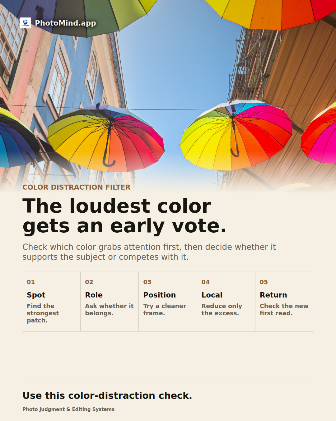
In an umbrella-covered street, saturated color is the point. In a quiet portrait below those umbrellas, one bright patch may compete with the face. The same color needs different treatment depending on the image's purpose.
Keep in mind
A colorful supporting element can carry identity or context. Reducing it is useful only when hierarchy improves.